Saturday, 29 November 2014

A2: Research and Planning - Film Posters

As part of my research, I decided to look at different film Posters and analyse them.
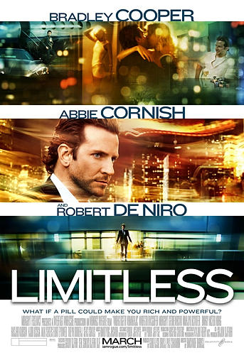
One of my favorite Film Poster that i came across was the 'Limitless' one. The idea of three images being present on the cover made it look more appealing. As well as this, the editor added the names of the actors under each image. The title of the film 'Limitless' is  positioned on the bottom of the page.
The layout of this particular poster appealed to me and may be one of the posters I base my film poster on.
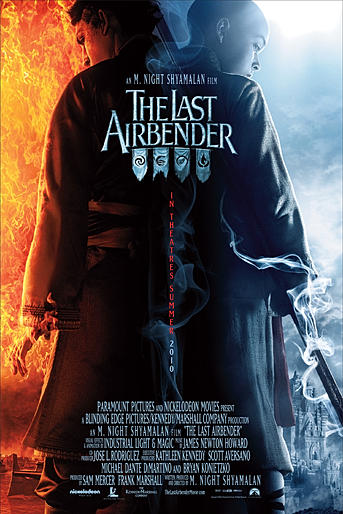
Two conflicting images were present on this poster as well as the vertical film title positioned in the middle separating the two images.

Wednesday, 26 November 2014

A2: Research and Planning - Film Magazine Covers

Researching different covers for film magazines and analyzing them was useful as I came to fully understand the generic conventions used.


Masthead - A defining feature of Empire magazine is the ever changing appearance of the Masthead. While the location and size of the title remains the same, the colour and theme often changes with the genre of the film advertised in the main image. This is a very attractive and appealing method of grabbing the reader's attention and automatically relating the topics of the magazine to the film story, so if the style appeals than the reader will be inclined to read on.

Main Image - The main image is the focal point and main focus of the front cover. It is positioned in the very centre of the page which is particularly eye catching and perhaps the biggest feature on the page. The mid shot of the character holding a weapon immediately tells the audience that the film belongs to the fantasy/adventure genre. The image also feature another merged image with the supposed villain looking at the character. The main image not only looks visually stunning but also informs the audience a little about the plot.

Catch-lines - The catch phrases used particularly 'THE FINEST MIDDLE-EARTH COVERAGE CONTINUES INSIDE' provide encouragement to the reader and almost lures them in persuading them to read more inside and buy the magazine.

Colour Scheme - The colour scheme of the magazine is very important to the theme of the magazine's story, it also stands out to the audience in numerous ways. The dark blue contrasts well with the black used and also contrasts well with the golden coloured text making it clearer for the reader to read. The colours are used to perhaps connote mystery, adventure and evil. At a glance, the genre of the film is instantly recognizable.


Tuesday, 4 November 2014

A2: Genre

Psychological Thriller
Psychological thriller is a fictional thriller story which emphasizes the psychology of its characters and their unstable emotional states. In terms of classification, the category is a subgenre of the broader ranging thriller category, with similarities to Gothic and detective fiction in the sense of sometimes having a "dissolving sense of reality", moral ambiguity, and complex and tortured relationships between obsessive and pathological characters. Psychological thrillers often incorporate elements of mystery, drama, action, and horror, particularly psychological horror. They are usually books or films.